
Introduction :
Few hues soothe the eye like green. From airy mint to moody forest, the right green colour combinations can refresh a room, anchor a décor theme, or add drama while still evoking calming interiors that mirror nature. Use the pairings below to find a palette that matches your taste and to pick the perfect Nippon Paint system that keeps it looking pristine for years.
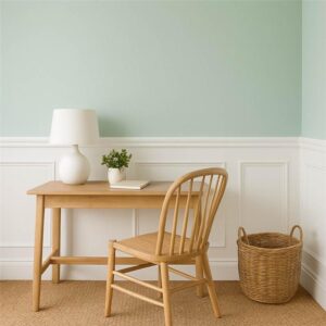
1.Mint + White – Airy Serenity
A pastel mint wall against crisp white trims visually enlarges compact bedrooms or study nooks. The gentle contrast produces instant brightness and an uncluttered feel.
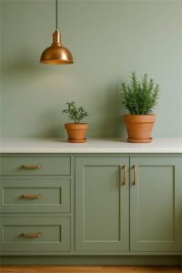
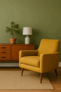
2.Sage + Copper – Nature-Inspired Warmth
Muted sage walls paired with burnished-copper light fixtures or kitchen hardware create a grounded, nature-inspired design that feels organic yet refined.
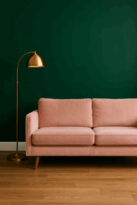
3.Emerald + Blush – Sophisticated Contrast
Deep emerald as an accent wall balanced by a blush sofa or bedding offers a luxe green contrast color that flatters metallic décor and artwork. Great for living rooms seeking a jewel-box vibe.
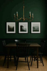
4.Forest + Black – Gallery Drama
A dark green palette of forest walls trimmed in matte black turns foyers or dining rooms into statement zones perfect for displaying monochrome photography or bold canvases.
5.Olive + Mustard – Retro Calm
Prefer mid-century flair? Pair soft olive walls with mustard upholstery or cushions. The two earthy tones harmonise without overwhelming, keeping the space relaxed yet characterful.
Paint Systems That Preserve Your Greens
| Area | Recommended Product | Key Benefits |
| Exterior walls | Weatherbond PRO | Pure acrylic film forms a waterproof, anti-carbonation shield, bridges hairline cracks, resists algae and dust. |
| Interior or sheltered exterior walls | Nippon Paint Atom 2-in-1 Interior–Exterior Emulsion | Crack-bridging 2-in-1 emulsion delivers excellent coverage and a four-year protective finish. |
Need inspiration for exact shades? Browse the complete Blue-Greens palette to lock in undertones that match your furnishings and natural light.
Quick Application Tips
- Test a swatch . Colours shift with lighting; paint a 1 ft² patch and observe for 24 hours.
- Mind sheen level . Matte hides minor wall flaws; silk finish intensifies darker greens.
- Use painter’s tape to maintain crisp junctions between contrasting hues.
FAQs
Q1. What’s the most relaxing green for bedrooms?
Soft sage or muted mint promote calming interiors by reflecting natural foliage tones.
Q2. Do dark greens make rooms look smaller?
Not if balanced with light ceilings, ample lighting, or reflective décor. An accent wall in a dark green palette can even add perceived depth.
Q3. How many coats are ideal for deep greens?
Two coats ensure uniform richness; the high-opacity formula of Nippon 2-in-1 often covers in fewer passes.
Q4. Will Weatherbond PRO stop exterior colour fading?
Yes. Its UV-resistant pure-acrylic film slows chalking and maintains vibrancy even in harsh Indian summers.