
Choosing the right paint color can completely transform your space—but it’s also where many homeowners go wrong. With so many wall paint color ideas, home interior color combinations, and modern wall paint colors available today, making the right decision can feel overwhelming.
This guide will help you understand how to choose paint colors for home while avoiding common mistakes that could cost you time, money, and satisfaction.
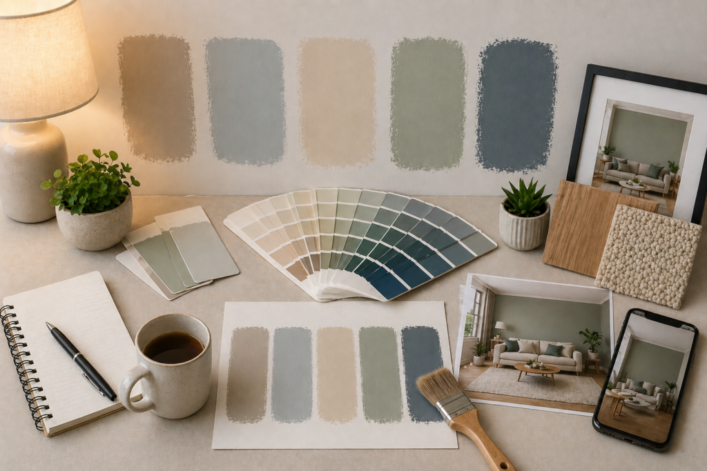
Why Choosing the Right Paint color Matters
Your wall colors define the mood, perception of space, and overall aesthetic of your home. The right color combinations for walls can make a room feel larger, brighter, and more inviting—while the wrong choice can do the opposite.
Whether you’re exploring living room wall color ideas or bedroom wall color ideas, your decision should go beyond trends and focus on harmony, lighting, and functionality.
Common Mistakes to Avoid When Choosing Paint Colors
Choosing the wrong paint color is one of the most common—and expensive—mistakes homeowners make during a renovation or makeover.
With endless wall paint color ideas, modern wall paint colors, and home interior color combinations available today, it’s easy to feel confident about a choice initially—only to regret it once the paint is on the wall. Many people focus only on trends or personal preference, ignoring practical factors like room function, furniture coordination, and long-term visual comfort. This often leads to repainting, wasted costs, and dissatisfaction with the final result.
Understanding these common mistakes will help you make smarter decisions, avoid costly errors, and confidently choose colors that truly enhance your space.
1. Ignoring Lighting Conditions
Selecting colors without considering lighting is one of the biggest mistakes in paint selection. Natural daylight, artificial lighting, and even the direction your room faces can completely change the tone of a shade. A color that looks warm and soft during the day may appear dull or cool at night. This is why relying on how a shade looks in a store or catalogue can often lead to unexpected results once applied at home.
- Bright sunlight enhances warm tones
- LED lighting can make colors look cooler
- Dim lighting may dull even thebest paint colors for home
Always test shades at different times of the day.
2. Choosing colors from Tiny Swatches
Small paint swatches can be misleading, as they don’t reflect how a color will look when applied across a larger surface.
When confined to a tiny sample, undertones and depth are hard to judge accurately. Once the same color is painted on a full wall, it can appear much darker, brighter, or more intense than expected. This is a common reason why homeowners feel disappointed after painting.
A color that looks great on a small swatch may look completely different on a full wall.
Instead:
- Use larger samples
- Try peel-and-stick swatches
- Test on multiple walls
This is especially important when selecting trending wall colors for home.
3. Following Trends Blindly
Small paint swatches can be misleading, as they don’t reflect how a color will look when applied across a larger surface.
When confined to a tiny sample, undertones and depth are hard to judge accurately. Once the same color is painted on a full wall, it can appear much darker, brighter, or more intense than expected. This is a common reason why homeowners feel disappointed after painting.
While latest paint color trends can inspire you, they may not suit your space.
For example:
- Dark colors may not work in small rooms
- Bold shades can overpower minimal interiors
Balance trends with practicality and your personal style.
4. Not Considering Furniture & Decor
Your wall color should complement your existing interiors, not clash with them.
Walls act as a backdrop for everything else in the room, including furniture, flooring, and decor elements. Choosing a shade without considering these can result in a mismatched or unbalanced look, even if the color itself is appealing.
Your walls don’t exist in isolation. Your paint should complement:
- Furniture
- Curtains
- Flooring
- Lighting fixtures
When planning home interior color combinations, always think of the full picture.
5. Overusing Bold Colours
Bold colors can add personality and depth, but overusing them can make a space feel overwhelming or visually heavy.
While deep or vibrant shades are often part of modern wall paint colors, using them excessively can reduce visual comfort, especially in smaller rooms. The key is to use bold tones strategically to create contrast without overpowering the space.
Bold shades can look stunning—but too much can overwhelm the space.
Instead:
- Use accent walls
- Combine with neutral tones
- Stick to balanced simple wall color combinations
Use them for accents and balance with simple wall color combinations.
How to Choose the Perfect Paint Colour
The right paint color has the power to completely transform a space—but choosing it requires more than just a good eye for colour.
Instead of relying on guesswork, taking a thoughtful and practical approach can make all the difference. By understanding how colors interact with your environment and design elements, you can confidently choose a shade that not only looks beautiful but also feels right in your space.
Start with Room Function
Different rooms need different moods:
- Living room→ warm, welcoming tones like Soft yellows & golden tones- Caramel Twist — AC 2139 A, Earthy Neutrals- Almond Chip — NP N 1831 P, Warm Whites & Off-Whites – Butter Toast — NP N 1844 P
- Bedroom → calming, soft hues like Senate Blue — PB 1513 D, Bamboo Leaf — NP BGG 1792 A, Monet Lavender — NP PB 1433 P, Martha’s Pink — NP R 1354 P
- Kitchen → fresh, vibrant colors such as Bright Smile — NP YO 1155 A, Crisp Green — NP BGG 1613 P, Blue Entry — NP BGG 1574 T, Sashay Red — NP R 1260 A, Purple Heather — NP PB 1458 T
This is why room color ideas for home should always be purpose-driven.
Use the 60-30-10 Rule
When it comes to creating a visually balanced and harmonious space, the 60-30-10 rule is one of the simplest yet most effective guidelines in interior design.
Instead of randomly mixing colors, this rule helps you structure your home interior color combinations in a way that feels cohesive. It ensures that no single color overwhelms the space while still allowing room for contrast and visual interest.
A classic interior design rule:
- 60% dominant color (walls)
- 30% secondary color (furniture)
- 10% accent color (decor)
This helps create balanced house painting color ideas.
Test Before Finalizing
Never skip testing:
- Paint sample patches
- Observe in daylight & night
- Compare multiple shades
This ensures your chosen shade truly works in your space.
Consider Space Size
color can visually alter space:
- Light colors→ make rooms look bigger ->shades like Pastry Puff (NP N 1843 T), Birch Patina (NP N 1852 P), and Etheria Blue (NP N 1963 P) from Nippon Paint are excellent choices.
- Dark colors → create a cosy feel ->shades like Sable Brown (NP N 1876 A), Mushroom Brown (NP N 1882 T), and Abacadabra (NP N 2034 P)from Nippon Paint are ideal
This is key when selecting modern wall paint colors for apartments or compact homes.
Explore Nippon Paint color Shades Before You Finalise
Before making your final decision, it’s always a good idea to explore real paint shades instead of relying only on generic ideas. This helps you to visualize how colors will actually look in your home and shortens the decision-making process.
You can explore the full shade catalogue here:
Explore Nippon Paint color Range
Nippon Paint offers colors across multiple families like Off Whites, Neutrals, Blues & Greens, Yellows & Oranges, Reds & Pinks, and Accents, making it easier to find shades that suit every room and style.
Final Checklist Before You Decide
Before finalizing your colour:
- Have you tested the shade on your wall?
- Does it match your furniture and decor?
- Have you checked it in different lighting?
- Does it suit the room’s purpose?
If yes—you’re ready to go!
Choosing the right paint color doesn’t have to be complicated. By understanding lighting, space, and design balance, you can confidently select shades that elevate your home.
Whether you’re exploring wall color combinations or looking for modern wall paint colors, the key is to test, plan, and avoid common mistakes.
With the right approach—and expert-quality solutions from brands like Nippon Paint—you can create a space that truly feels like home.