
Introduction
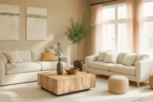
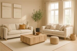
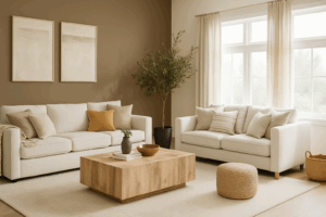
Trends may come and go, but neutral shades never lose their charm. They form the foundation of timeless design, adding elegance, warmth, and versatility to any space. From soft greys to warm beiges, neutral tones help create a calm, inviting atmosphere that adapts beautifully to changing styles and moods.
Whether you’re decorating a new home or refreshing your current space, these neutral paint ideas from Nippon Paint will help you build a home that feels forever in style.
For more inspiration, explore our Neutral Colour Range to find the perfect shade for your space.
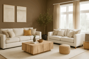
1. Pebble Walk (NP N 1817 P) – Subtle Serenity
Soft, smooth, and effortlessly refined – Pebble Walk (NP N 1817 P) captures the tranquility of misty mornings. Its pale grey undertone works beautifully as a base colour, pairing well with wood textures, white trims, and greenery.
Design Tip: Combine it with minimal furniture and natural fabrics for a clean, contemporary vibe.
If you’re exploring soft neutrals that complement Indian homes, browse Home Painting Colour Ideas for more inspiration.
2. Sanded Birch (NP N 1818 P) – Warm Minimalism
This shade embodies understated warmth with a hint of beige. Sanded Birch (NP N 1818 P) adds a gentle touch of coziness while keeping interiors airy and sophisticated.
Pair With: Muted whites, tan upholstery, and warm metallic accents like gold or copper for a cozy yet elegant tone.
Its adaptability makes it a go-to for homeowners seeking classic interior colors that age gracefully.
3. Old Box (NP N 1820 A) – Rustic Sophistication
For those who appreciate character and depth, Old Box (NP N 1820 A) offers the richness of aged taupe with a modern edge. It anchors lighter décor and adds definition to open-plan spaces.
Pro Tip: Pair it with neutral accessories and soft lighting for that rustic-meets-refined balance.
Want to experiment beyond beige? Discover more tones in our article on Amazing Home Painting Colour Ideas.
4. Crete Barrel (NP N 1821 D) – Timeless Depth
Crete Barrel (NP N 1821 D) is a deep, grounded neutral that adds sophistication to any modern or classic setting. It carries a subtle earthy undertone, creating a comforting, cocoon-like atmosphere.
Style Tip: Use this shade with contrasting lighter tones like Pebble Walk to maintain balance in your elegant home color scheme.
5. Golden Grain (NP N 1842 D) – Soft Radiance
Adding a golden warmth to your interiors, Golden Grain (NP N 1842 D) embodies the warmth of morning light. Its subtle yellow tint adds optimism without overpowering the room.
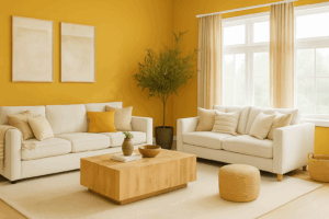
Pair With: Dark wood furniture or matte black fixtures to create contrast within your neutral paint ideas palette.
Conclusion:
Creating a timeless home starts with choosing colours that transcend trends. Neutral tones like Pebble Walk, Sanded Birch, Old Box, Crete Barrel, and Golden Grain bring balance, depth, and sophistication – forming the perfect canvas for any décor style.
Whether your taste leans modern or classic, these shades help you design a home that remains effortlessly elegant year after year.
For more inspiration on classic interior colors and curated combinations, explore Nippon Paint’s Neutral Collection.
FAQs
1.Why are neutral paint colours considered timeless?
Neutral tones blend easily with evolving trends and décor styles, ensuring your interiors remain elegant and relevant over time.
2.What are the best neutral colours for small rooms?
Lighter shades like Pebble Walk or Sanded Birch reflect more light, making compact rooms appear larger and brighter.
3.Can I mix warm and cool neutrals in one space?
Yes – combining shades like Golden Grain (warm) with Pebble Walk (cool) can create balance and visual interest.
4.How do I prevent neutral rooms from feeling dull?
Introduce texture through rugs, fabrics, and accent lighting. Adding metallic or wooden finishes enhances dimension.
5.Which finish works best for neutral interiors?
Matte finishes deliver a soft, modern look, while satin finishes add a gentle sheen – perfect for creating a timeless design.