
Introduction
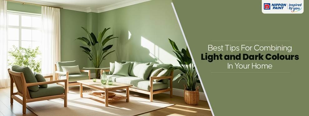
Striking the right balance between light and dark color combinations can completely redefine your interiors. When used thoughtfully, this contrast adds dimension, balance, and character creating a space that feels both vibrant and grounded.
From cozy living rooms to minimalistic bedrooms, understanding how to blend complementary colors ensures your home looks cohesive, elegant, and full of personality. Let’s explore the best ways to use this contrast effectively in modern interior design ideas.
Why Light and Dark Colors Work So Well
The secret behind a beautiful interior lies in contrast. Pairing light and dark shades helps in achieving balanced home decor, one that feels dynamic yet harmonious.
- Adds Depth: Dark tones anchor your space, while lighter hues open it up.
- Defines Spaces: The contrast can subtly separate functional areas without walls.
- Enhances Light Flow: Light colors reflect natural light, making dark accents pop.
- Creates Visual Interest: The interplay between light and dark builds rhythm and energy in the room.
Top Light and Dark Color Combinations to Try
Each pairing below balances boldness and softness perfectly. These shades from Nippon Paint’s palette work beautifully across different moods and room types.
1. Dark as Night (NP N 3098 A) & Fairy Lights (NP R 1339 T)
A perfect union of mystery and glow.
The inky tone of Dark as Night adds modern drama, while Fairy Lights brings gentle radiance. Ideal for bedrooms or living rooms that need a calm, intimate atmosphere.
Design Tip: Use the darker hue on one focal wall and keep the rest light to maintain spaciousness.
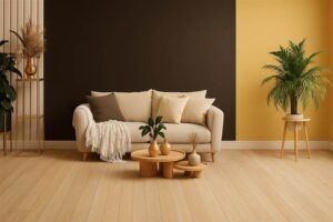
2. Dark Brunette (NP N 3198 A) & Amber Light (NP YO 1145 P)
This pairing creates an earthy, welcoming feel.
Dark Brunette offers a cozy, grounded base, while Amber Light adds golden warmth that reflects beautifully under ambient lighting.
Best For: Dining spaces and entryways warmth and invitation matter most.
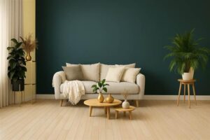
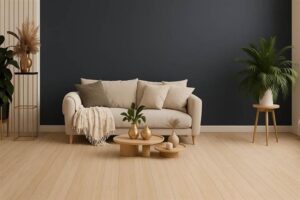
3. Dark Horizon (NP N 3392 D) & Daylights (NP YO 1201 P)
Perfect for modern interiors that embrace clarity and contrast.
The deep bluish Rey of Dark Horizon anchors the room, while Daylights, a soft, creamy tone enhances openness.
Style Tip: Pair this combo with minimal décor, white furniture, and metallic accents for a sophisticated urban feel.
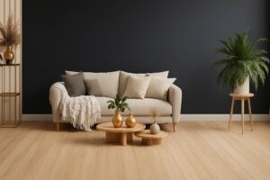
4. Dark Secret (NP PB 1561 A) & Enlightened (NP OW 2169 P)
A timeless contrast that feels effortlessly elegant.
Dark Secret, a deep Plum inspired tone, pairs beautifully with Enlightened, a clean white with subtle warmth.
Perfect For: Bedrooms and home offices this combination promotes calm yet luxurious energy.
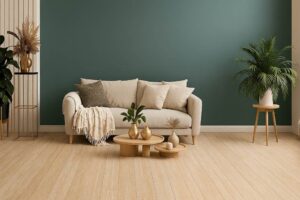
5. Dark Prism (NP N 3316 P) & Flash of Lightning (NP YO 2541 P)
A vibrant, energetic pairing for those who love bold modern interiors.
Dark Prism’s strong character is balanced by the soft, glowing undertone of Flash of Lightning.
Use It In: Living areas, hallways, or feature walls to add personality and artistic flair.
Expert Tips to Balance Light and Dark Colors
- Follow the 60:30:10 Rule
- 60% dominant color (usually the lighter tone)
- 30% secondary shade (the darker contrast)
- 10% accent color (metallics, plants, or décor pieces)
- Using Lighting Smartly
Lighting can completely alter how colors appear. Use warm lighting for cozy contrast and cool lighting for a crisp, modern finish. - Match the Mood to the Room
Darker tones are best for relaxation areas, while lighter tones energize workspaces and dining areas. - Play with Texture and Finish
Combine matte dark walls with glossy light finishes or vice versa to add tactile balance. - Add Complementary Elements
Bring balance through rugs, art, and accessories that bridge the two tones, for instance, beige cushions on a navy sofa or black frames on a cream wall.
Using Light and Dark Tones Across Your Home
Living Room
Create a statement wall in a deep hue like Dark Horizon or Dark Brunette and balance it with lighter shades across furniture and décor. Add warm lighting to highlight the contrast.
Bedroom
Choose muted pairings such as Dark Secret & Enlightened for a cozy and restful retreat. Soft fabrics and minimal décor keep the space inviting.
Kitchen or Dining Area
Pair Amber Light walls with Dark Prism cabinets for a warm yet modern atmosphere that’s perfect for gatherings.
Study or Work Nook
opt for Dark as Night & Fairy Lights to focus and comfort the darker tone to enhance concentration, while the lighter hue prevents visual fatigue.
Creating Cohesion with Complementary Colors
When combining light and dark shades, it’s important to introduce complementary colors that pull the palette together to think metallics, wood tones, or plants.
- Wood adds natural warmth.
- Metallics (like gold or silver) bring in elegance.
- Greenery softens the contrast and adds freshness.
Each of these elements ensures your interiors look balanced, not busy.
Bringing It All Together
The magic of light and dark color combinations lies in balance. When thoughtfully chosen, they make your home feel layered, dynamic, and timeless. Whether you love bold contrasts or subtle gradations, these Nippon Paint pairings
Dark as Night & Fairy Lights, Dark Brunette & Amber Light, Dark Horizon & Daylights, Dark Secret & Enlightened, and Dark Prism & Flash of Lightning
bring both sophistication and comfort to your space.
Experiment, trust your instincts, and let contrast tell your home’s story beautifully.
FAQs
1.How do I choose the right balance between light and dark colors?
Follow the 603010 rule 60% light base, 30% dark contrast, and 10% accent color to keep the décor visually balanced.
2.Are light and dark combinations suitable for small rooms?
Yes! Use darker shades on one wall or in furniture, and lighter tones elsewhere to create the illusion of space.
3.Which lighting works best for dark walls?
Warm yellow or soft white lights enhance depth and highlight the contrast without making the space feel closed in.
4.Can I mix more than one light dark pair in a single room?
You can but maintain cohesion by sticking to one dominant palette and using the others as subtle accents.
5.How do I keep the contrast from feeling too harsh?
Soften the transition with midtones like beige rugs, cream curtains, or wooden accents to create a smooth visual flow.