

When it comes to selecting paint colours for a room, you can easily find one colour that works, but selecting two colours that look good together is a real task. Creating a visual appeal by pairing two hues is where most people struggle. Obviously, colour choices are subjective but I bet there is a few we can all agree on. Here we look at a few of the common colour combination you should avoid.
Warm and cool colour always repels:

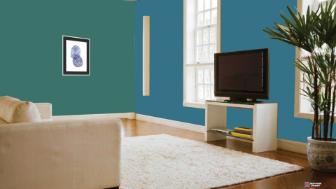
Each wall paint colour has the ability to alter the mood and personality of the occupants in its own way, this is also known as colour psychology. While warm colours tend to advance toward us and create a friendly atmosphere, Cool colours prefer to recede away from us, creating a spacious feeling. So, when you mix two colours that are on opposite sides of the colour palette, they compete with each other. Never mix these two colour palettes together as the difference in mood is too stark for a room.
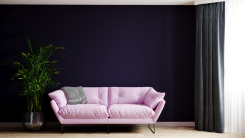
Dark colours don’t go well together:

Your job doesn’t end when you choose the colour of your room; you also need to pick the brightness of the colour you want in your room. The brightness of the colour you pick of your room will influence the mood of your family. Using two colours in the darkest of shade will make your room look all gloomy and bleak. Even aesthetically, unlike light colours, dark colours don’t go well together. They create a vibration due to similarities in their high intensity and they look tacky together. It is best to use dark colours as accent walls and match with them with pillows, bedding, curtains, or furniture in your homes.
Matching has a limit:

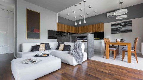
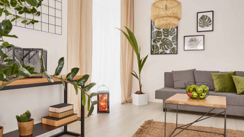
Yes, it is good to match things around your home and play it safe. However, going overboard with matching colours on your wall will make your room look plain and mundane. By employing only matching colour combinations in your wall, you miss out on the chance to juxtapose contrasting colours. While it may be tempting to keep things simple and match all your accessories and furnishings to your walls, you do not want your room to look like it suffered an overdose of a single colour scheme.
Right mix:

While mixing two or more colours, it is important to use all the colours in an appropriate ratio. Using two or three colours in an equal ratio will make your room look one too many colours in your room. You need to find the ideal balance in using multiple colours in your room. While using more than 2 colours, following the colour principle of 60-30-10 gives your colour combination a visual appeal. According to this principle, you should paint 60 per cent of your room with the dominant or primary colour that you choose, 30 per cent should be the secondary or the complementary colour and 10 per cent should be accent colours.
Don’t go with the trends:

Do you really think you could live with a colour you are not gravitated to? We think not. The walls you live within every day should be painted in colours that you love. Yes, it would be tempting to keep your house up-to-date with trends. Instead, it is best to incorporate trends in small doses, like pillows, throws and so on and paint your home with colours you like.
Colours can affect you on various aspects but its primary role is to attract the viewer visually. So, avoid the above-mentioned mistakes and give your room a good visual representation.


